Context
Duolly is a conversational assistant that companies put on their own site: it searches their content, talks in chat and voice, and shows interactive elements like product cards, forms and quick replies.
Before Duolly 2.0 every installation was a project of its own, with a back office tuned by hand for each client. Duolly 2.0 changed two things at once. The business went from custom projects to a multi-tenant SaaS, and the engine went from a single prompt to agents: an orchestrator hands each question to specialised agents, which use tools, knowledge bases and widgets.
The design problem was to let a non-technical admin configure a system that is technical by nature, while the backend and the functional analysis were still being written.
My role
I led the design of Duolly 2.0, and a good part of the job was deciding how the work should be done before doing it. The functional analysis was still a draft, so the rule for the whole team was: understand first, then draw. Where the backend had no model yet, the wireframe became the requirement.
I brought two part-time UX designers onto the project, planned the work screen by screen and reviewed each flow with them. Every question the documents left open was logged with the person who had to answer it, which kept the product owner and the backend, frontend and AI teams working from the same page.
It ran from the first audit of the old back office to a working frontend the development team uses as a living spec, between June and September 2026.
- 4
- months, from audit to working frontend
- 21
- menu items for about 131 features
- 116
- open questions, each with an owner
- 36
- API calls specified for developers
Understand first
Before drawing anything I mapped the existing back office: ten areas, sixteen annotated screens and the needs of four profiles. Every row of the board reads the same way: the real screen, what it does, its fields and actions, its UX problems.
What came out. Navigation followed the system's objects, not people's tasks. "Configuration" held everything at the same level. Dependencies were hidden, states were poor, analytics described without guiding.
The most useful finding: the assistant already had a lifecycle (sources, scenarios, guardrails, models, analytics), and the interface hid it. A chain was presented as five parallel menus.
Decide what to do
The problems became a UX roadmap, each item with a priority and a nature: a structural redesign or a local fix.
Six principles framed it: tasks not objects, explicit dependencies, visible states, clear and safe actions, from data to decisions, experiences by role.
I put three architectures side by side (hybrid, by domain, by lifecycle) with the criteria for choosing written down, and took one message to management: rationalise first, then design.
From back office to SaaS
The new architecture rests on two consoles. The Platform Console is for Fiven: clients and plans, releases, quality across tenants, security. The Tenant Workspace is for the client, and its menu follows the assistant's lifecycle in four pillars: Build, Validate, Observe, Configure.
One rule shaped version two: every function has one home. Twenty domains, about 131 features, a menu of 21 items. The project plan was then reorganised on the same base, so each feature matches a menu item and design can be estimated screen by screen.
After the wireframes I updated the map to v3 in the same visual language, with sticky notes explaining what changed and why. A map that evolves, not a new document.
Analysis before drawing
The functional analyses left many points open. Instead of filling the gaps with guesses, I set up a method that shows what is known and what is not.
- Read, model, then draw. A conceptual model for each menu item (objects, attributes, relations, states) before any wireframe. Where the backend had no model yet, the wireframe became the requirement.
- A register of questions. Every row is something the documents do not say, with its source, its impact on design and who has to answer. 132 decisions and 116 questions in nine days.
- "Missing analysis" as a component. A dashed red box stands where no document describes the content, so a gap is visible and nobody mistakes it for a decision.
- Two-hat reviews. At the end of each flow, one pass as a UX designer (does someone new to this understand it?) and one as an agent engineer (is it valid, complete, buildable?).
- Notes, not annotations. At most three per screen. Annotations went from 145 to 35 and the file became readable again.
Navigation, in five steps
Navigation is what changed most, and each step had a reason. We started from a sidebar with every item exposed, which mixed list and detail. A hybrid rule followed: anchors when sections are faces of the same object, sub-pages when they are different objects.
 Hypothesis AHypothesis C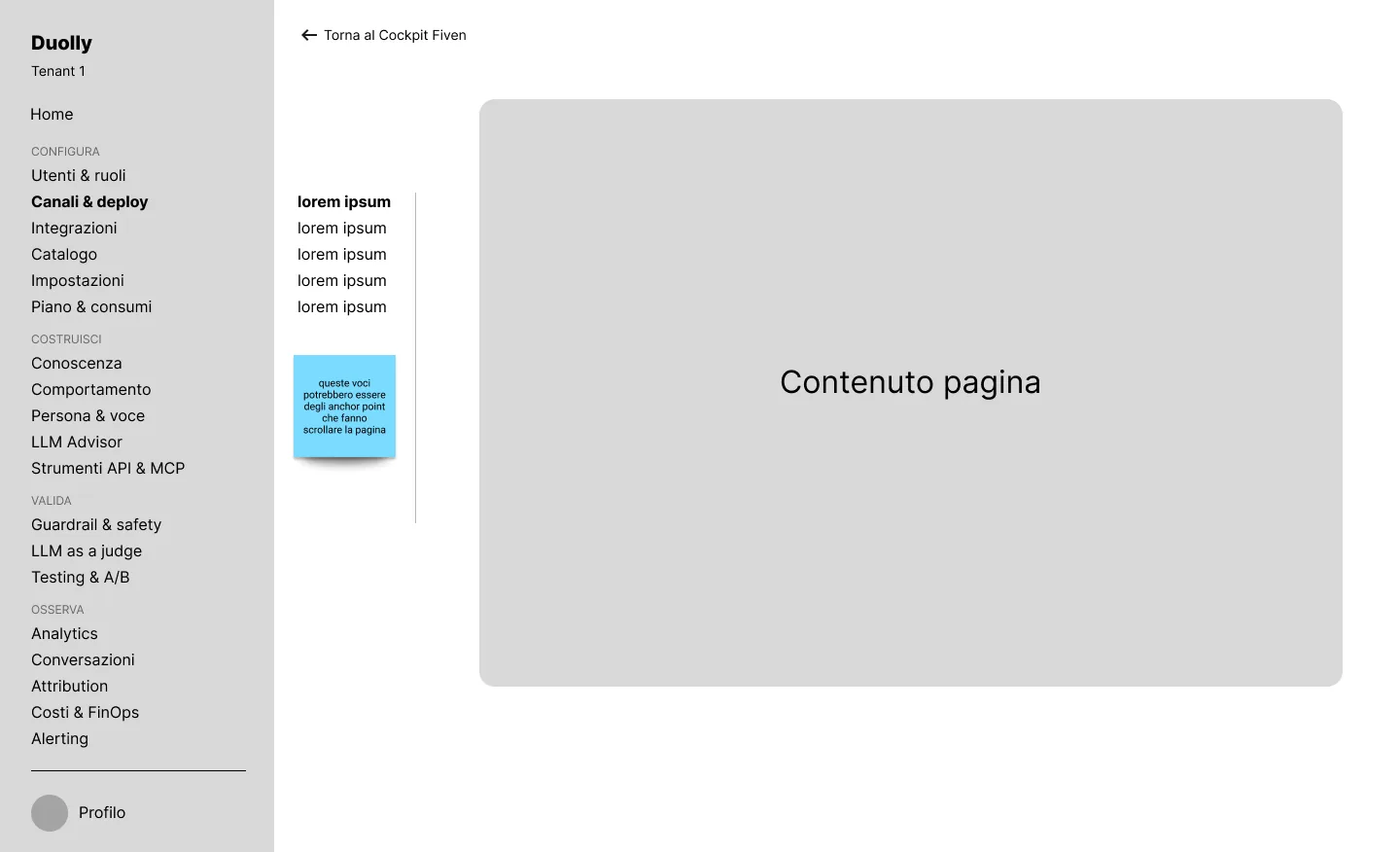
Then a colleague proposed Hypothesis C, because the left column still meant two things. Now each element has one meaning: top tabs for the pillar, sidebar for the items, content tabs for views of a record, an in-page index for sections.
The cost is declared (one extra click between pillars), so global search came in, with results grouped by pillar, opened from the header over wherever you are.
Last, the pillars became real pages: where you stand, what to fix before moving on, what people talking to the assistant actually get, and the sections with their state.
Area by area
Knowledge. A switch that says what happens ("Active: its sources feed the answers"), and an embedding model that locks itself once indexed, with the consequence written out.
Tools. For an agent, a tool's description is the real code: it decides whether to use it by reading it. So the most important field is called "What it does (the agent reads this)", and the top of the page lists what is missing before the tool can go live.
Secret keys. They are never read back, only replaced, and the new value is tested on the tools that use it before saving.
Agents, drawn as a map
The analyses described routing as a prompt, the backend as a graph. I needed a form an admin could read and the system could run.
The flow is a map of what is allowed, not a script of what happens. The layout is computed, so nobody can draw a flow the system cannot execute. A question passes the guardrail, reaches the orchestrator, goes to an agent; the condition sits on the arrow.
Under each agent you see the tools it uses, the widgets it shows and the data it keeps. A node opens in a panel beside the map, never over it.
The orchestrator is an agent like the others, pinned at the top. The manual said the steps people forget most are registering a new agent with the orchestrator and updating its routing. Keeping those in two separate menus would have made forgetting part of the product.
A design system that matches the code
I did not reinvent the foundations: shadcn/ui on Base UI, Lucide icons, Geist, customised at the token level. Tokens come in three layers, with light and dark pairs, and the flow map has a palette of its own, kept apart from status colours.
The Figma file was built from the code, with the same names on both sides and an automatic check that flags components missing from design. Thirty pages, 106 components, 462 variants, 277 variables, with guidelines and specs inside the file.
A reference frontend
Not a clickable prototype but a real application on mock data, working as a living spec for the development team. A fake server answers like the backend, with latency, errors and empty lists, and the 36 calls are written up as an API contract.
I built it with Claude Code and Codex, inside rules I wrote: the project instructions, sixteen automatic checks that run on every change, a changelog. Wireframes and code moved forward together, so I ran a loop both ways: a handoff document for each round of design changes, an automatic comparison of interface strings against the Figma frames, and a log of visual fixes born in code to bring back into design. The agents sped up the execution; the method kept the quality.
- 19
- screens
- 62
- components
- 2
- languages
- 2
- themes
Built on mock data; the product itself is not public.
How it was built
Research and architecture in FigJam, wireframes and the design system in Figma, with repetitive edits scripted through the plugin API. The frontend is Next.js, React 19, TypeScript, Tailwind v4, shadcn/ui and React Flow with dagre, written with Claude Code and Codex under automated lint, type, test and build checks.